Scrubs & Beyond

REQUEST
Rebranding of one of America's leading
Rebranding of one of America's leading
scrubs apparel.
CLIENT
Scrubs & Beyond


Elevating Brand Identity for Scrubs & Beyond
CLIENT CHALLENGE
Scrubs & Beyond needed to reinforce its core
values—honest, approachable, inclusive, and
vibrant—through a unified, flexible design system.
The goal was to elevate their visual language
across digital and physical assets, creating
consistency while allowing room for
creative expression.
Scrubs & Beyond needed to reinforce its core
values—honest, approachable, inclusive, and
vibrant—through a unified, flexible design system.
The goal was to elevate their visual language
across digital and physical assets, creating
consistency while allowing room for
creative expression.
STRATEGIC APPROACH
Our team conducted a comprehensive brand audit,
identifying opportunities to expand the color
palette and refine typography for maximum versatility.
We aimed to create a visual language that
conveys authenticity and confidence, yet feels
warm and approachable.
identifying opportunities to expand the color
palette and refine typography for maximum versatility.
We aimed to create a visual language that
conveys authenticity and confidence, yet feels
warm and approachable.

Design System
COLOR PALETTE DEVELOPMENT
Building on the established Fern Grey and
Sunrise colors, we introduced a broader palette,
carefully curated to support dynamic storytelling
and brand recognition.
This palette ensures seamless integration across
editorial, e-commerce, and in-store collateral,
reinforcing a cohesive brand ecosystem.

Typography
& Hierarchy


Email Templates
& Design System
We developed a comprehensive Figma design system, an adaptable toolkit featuring over 20+ email templates with dynamic modules for versatile content pillars.
This system fosters consistency, streamlines content creation, and enables the in-house team to integrate and adapt assets seamlessly.
This system fosters consistency, streamlines content creation, and enables the in-house team to integrate and adapt assets seamlessly.


Retail & Store Visuals
We crafted attention-grabbing print and store collateral designed for maximum visual impact. From posters to retail signage, each piece was engineered to captivate from a distance and drive foot traffic.

Seasonal Campaign
We crafted a vibrant series of in-store and window posters designed to turn heads and drive foot traffic. With bold typography, fresh color accents, the visuals captured the season’s energy while staying true to the brand’s approachable tone. The result? A cohesive, uplifting presence across
every touchpoint.


Honeysuckle Limited Edition Release
Honeysuckle Limited Edition Release
To launch the limited-edition Honeysuckle colorway for White Cross VIBE, we designed a soft yet striking visual campaign that let the product shine.
The creative direction leaned into minimal studio-style photography paired with clean typography and subtle motion.
The creative direction leaned into minimal studio-style photography paired with clean typography and subtle motion.


Nurses Week
Campaign
FUN MEETS FUNCTION
We took a playful turn for 2025’s Nurses Week — designing a bold, humor-driven campaign that stoo out from traditional healthcare visuals.
Through punchy headlines like “This gift flops / This gift slaps” and quirky side-by-side visuals (think: soggy pizza vs. sleek scrubs), we created posters and digital assets that sparked smiles and clicks.


Other Projects
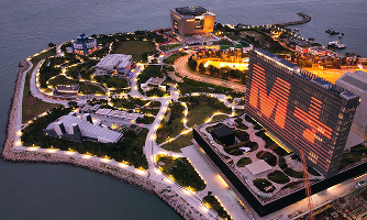
M+ Museum
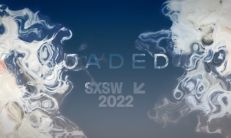
Jaded
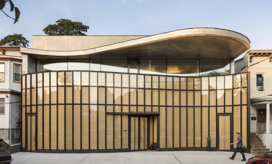
Louis Armstrong
House Museum
CREATE & ACCELERATE
-> YouTube
-> YouTube
NEWSLETTER
Subscribe for reflections on expressive design, creative workflows, and systems-driven approaches to creative work.
SUBSCRIBE
Subscribe for reflections on expressive design, creative workflows, and systems-driven approaches to creative work.
SUBSCRIBE
Far North is led by Creative Director Alexandra Liljebladh, with work spanning across the U.S. and international collaborations.